A few graphics and thoughts that I went through while designing some branding for nasa taxis.
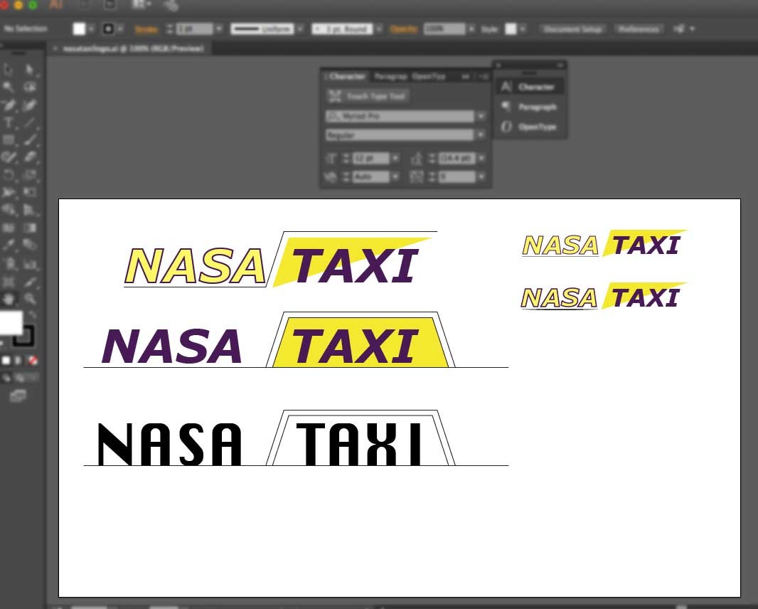
I wanted to use and get a color combo that was not in direct relationship to a competitor though the client did like those yellow and black colours..so experimenting with purple and yellow seemed to work.
In the shot below I started bottom left and worked up, quickly moving to a faster looking font verdana italic and I incorporated the rhomboid shape that is iconic for taxis. I played with the lines and fills thicknesses and colour. The bottom right would have been my pick as I think the rhomboid hasn't lost anything here. But at the end of the day I am here to please the client and I absolutely get subjectivity.
I am building Nasa Taxis a wordpress site because before this they just had a facebook page which was not easy to market and impossible to rank in google search. His new website is going to save a lot of money in the end and also give his new customers a lot of confidence moving forwards.
Quick facebook pages can be created by anyone! And that's the problem if you are serious about your business you need a website.
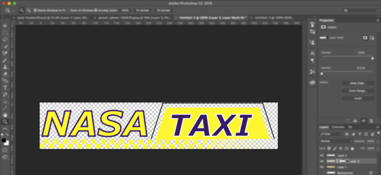
The Final Logo
Well for me it's not the final final logo. For getting the website started I need colours and a logo. It is very difficult to design a website without some kind of brand guidance.
If you liked this walk through of some REAL WORK then share this post as it really helps thanks.


