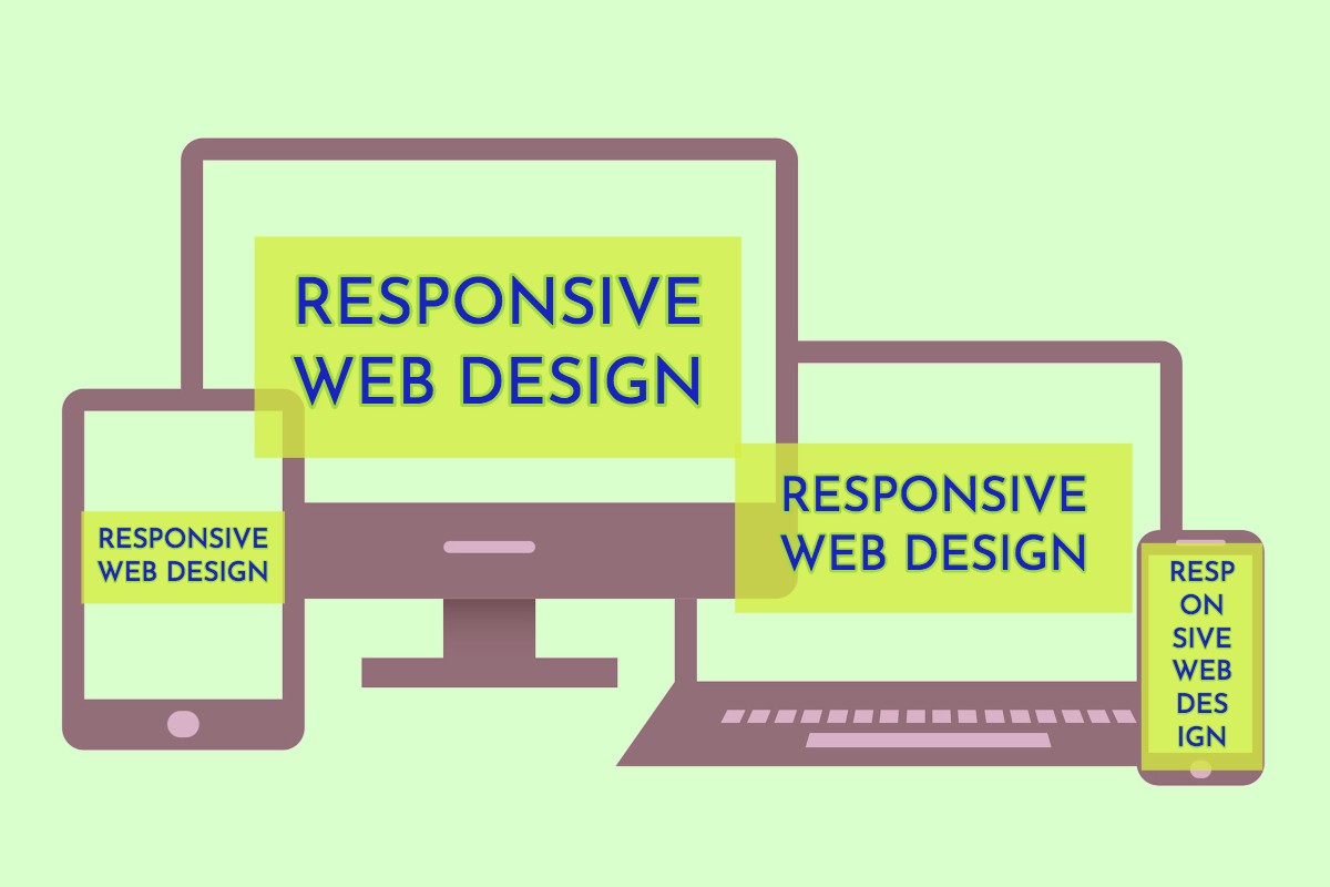
Responsive Web Design | Beyond Media Queries
I wanted to blog this video as it has some really important tips and suggestions as to how to do responsive code with respect mostly to css and take some pressure off media queries. Also I like the fact that typography is taken well in hand and also a good look at SVG images. The ability to scale parts of an image (remember chopping up a rounded box graphic with corners so it scales but doesn't have grotesque scale corners?)
Talk By Michael Riethmuller find him on twitter @MichaelRiethmuller
I have selected a few links that take you to the relevant sections as it is quite a long talk.
Breakpoints Under Pressure Breakpoints are really just an awkward start.
Fluid Typography
Calc() - Using expressions to get a dynamic size.
Modular Scales - You have to see this image of TRUMP!
Responsive SVG- Very powerful image rendering.
At the end what I love most is that very self degrading remark that he cannot design (he is a developer) and he wants to see where a designer can take his ideas and self discovered responsive solutions. It does remind us that this stuff is very complicated when you consider knowing also html and then javascript. I hate that recruiters don't get that or that design and development should come cheap this is no less skilful than some electronic engineer using applications and logic or an engineer making a bridge from software.
Lets start to credit developers and designers.
Also if you are buying a templated design this is the reason why, do you think that all this is possible as a custom solution each time? Templates are good they represent progress and we hope that Michael's work starts to make it into more and more of them.
Related Posts
Comments
By accepting you will be accessing a service provided by a third-party external to https://cambs.eu/


